ICYMI: Mobile & Emerging Tech; 48:2021
Week 48
Android 12. A review of Material You and other features that came with the latest version of Android. If you haven't already experienced it for yourself, this article gives a pretty solid overview of the main details as well as some screenshot candy. It also comes with a video if you don't care to read or prefer to multitask and have it playing in the background.
Galaxy Fold. A review of the Galaxy Z Fold3 from a month of daily use. In fully disclosure, the author also works for Android Police so it leans towards the positive, but the write-up still reads as sincere (see: battery life). And I'm still trying to figure out a way to get my hands on one (no dice on Black Friday/Cyber Monday deals boooo).
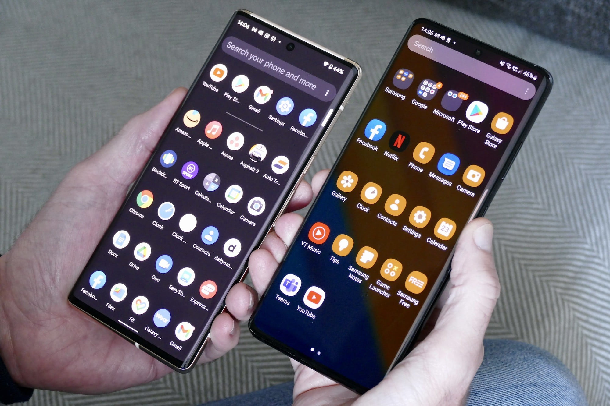
One UI 4. A nice side-by-side comparison of Android 12 a la Samsung vs Pixel 6 Pro. The author mainly compares items of everyday use, which I think is perfectly reasonable. It likely gives a more accurate impression of the experience of the majority of users.
Spotify. The Car View feature has been retired for both iOS and Android. And without a viable alternative for immediate use (however, it looks like I still have it?). It was a useful feature that promoted safe driving, so I do not follow their logic at all. As mentioned in the article, I'm also in the camp of users suspicious that the timing of this falls conveniently in line with the pre-order for Car Thing (quite literally the first thing I thought of when I came across the announcement).
Google Messages… will finally be getting iOS reactions on Android. That's it. That's the tweet.
From the desk of…
Continuing with the Android 12L deep dive, last issue we covered the Navigation Graph and related UI components. This week we'll get into actual layout concerns and view recommendations.
In the example app used for the Android Developer Summit, the very common list and detail pattern was implemented as separate views on the phone version. For the version targeting larger screens, the recommendation is conjoin those views in a single view using the List Detail layout. For foldables, this can be optimized further by using the Sliding Pane view to allow the layout to adjust as the device opens and closes.
The List Detail layout are just one of four Core Compositions (also referred to as Canonical Layouts) that are worth exploring. The most appropriate choice depends on your app and which patterns are already being used. But as you make layout choices, you should be asking yourself the following questions as you go:
- Getting larger — What can I add?
- Getting smaller — What can I take away?
You can read more about large screens and foldables under the Adaptive Design section of MD3.
Articles
- Android 12 review: Living in a Material (You) world via Engadget
- The Galaxy Z Fold3: Folding perfection via Wiki Weekly
- We compared Samsung’s One UI 4 against Android 12 on the Google Pixel 6 Pro via Digital Trends
- Spotify Pulls Plug on Car View Feature, Offers Users No Alternative via Gizmodo
- Google might finally fix iOS reactions in Android messages via Mashable
(Week 47… If I would've gotten it out)
- Google Has Reportedly Canceled Its Never-Announced Foldable Phone via Gizmodo
- Tesla Model Pi Smartphone Will Launch With Starlink Technology via IGeekphone
- Samsung's Galaxy S21 series updated to One UI 4 with new Android 12 features via Engadget
- Google Maps is adding new shopping tools for the holiday season via Digital Trends
- Beginning next year, Apple will send you parts and tools to fix your iPhone and Mac at home via TechCrunch
Events
- [Dec 9 @ 11am CST] The state of mobile shopping apps in 2021 via Bitrise
Resources
- [Guidelines] 3 things to know for Large Screens on Android! via Android Developers
- [Guidelines] Design Guide for Interaction Models via Alexa Developer Documentation
- [Video] Elevate 2021: On-Demand Replay via Airship
- [Video] Firebase Summit 2021 Replay via Firebase
- [PDF] Mobile Customer Experience Report 2021 via Poq
- [PDF] E-commerce App Report 2021 via Adjust