ICYMI: Mobile & Emerging Tech; 46:2021
Week 46
Push It. An app for sending custom push notifications to your friends, was trending no. 1 in Top Free Apps in the App Store. It's currently limited to Australia and California, which, obviously by the complaints under Ratings & Reviews, wasn't clearly communicated in the description. But what I really wanted to point out is that some of the 5-star ratings do not match the content of the review itself. Related: Campbell's Law.
App Store… will stay open to developer submissions over the holidays. As this is one of the busiest times of the year for app traffic, the change will be a boon for developers who need to push any critical fixes or updates. Of course the downside is that, if you're on a team that has to push out updates, you may not get the holiday break you intended.
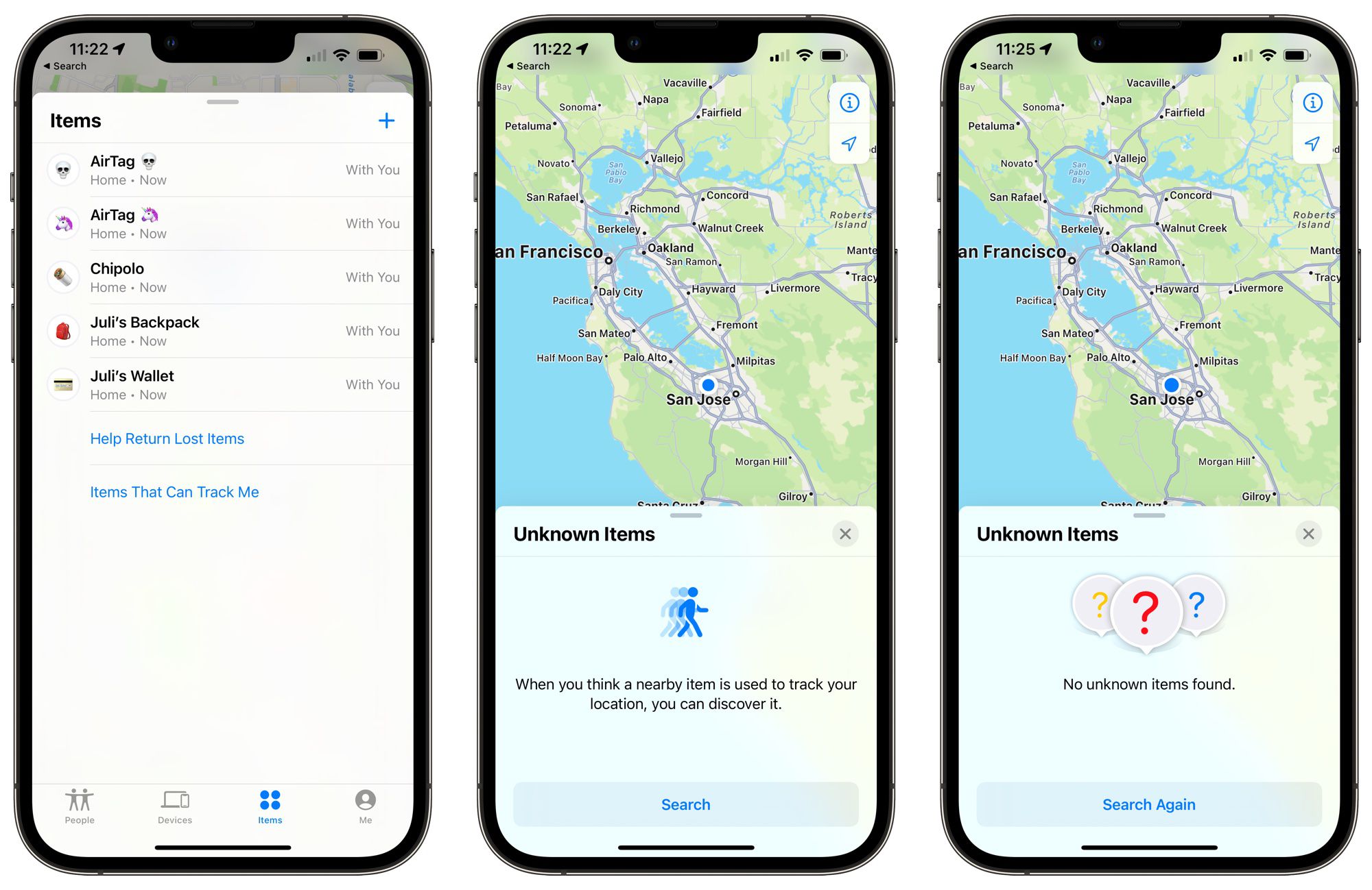
iOS 15.2 Beta. AirTag searches and Legacy contacts introduced in latest beta. In an effort to help deter stalking, Apple allows the ability to disable any nearby trackable items in the Find My app. You can now also designate someone as a Legacy Contact for accessing your digital info in the event of… ahem, your passing. We'll see how both of these features work once they hit public release.
Virtual Fitting Rooms. Everything that you need to know about the tech that allows shoppers to try stuff on at home. It's a bit of a long read, but this post by Emerging Tech Brew covers a brief history, the underlying tech, and the current challenges. Although I doubt that you'll ever be able to replace trying things on in-store, it's still pretty cool to see how far things have come along since the initial days of online shopping.
App Icon Book. A book that celebrates the art and craft and the golden age of icon design. In a thread on Twitter, Michael Flarup announced the Kickstarter campaign to power the first run of the now completed book. In what I'm sure will become the new coffee table book for mobile product peeps, it's just a shame that it won't ship in time for the holidays.
From the desk of…
Picking up where we left off, I'll continue to dig in further on Android 12L. Last week we thought about the why behind taking an app from phone to larger screens, this week we'll go over the how. At first pass, many of us — myself included — would likely want to start with layout concerns. After all, that's the most logical thing to address when changing screen sizes. However, some of the layout changes we might make could be affected by the navigation and app architecture and vice versa.
The UI component itself is an easier lift, so it might be better to start here. If you are using the bottom navigation pattern in the phone version of the app, Android recommends converting it to a navigation rail for larger screens. If you're not familiar, it was introduced earlier this year during Google I/O and rolled out with the subsequent Material Design updates. This pattern makes better use of the available real estate by moving the navigation from the bottom of the screen to the lefthand side.
In Android, there is the concept of the Navigation Graph (similar to the Navigation Stack in iOS, if you're more familiar with that). For those of us on the design side, it's essentially the development version of a screen flow. This may be a good time to review the overall architecture and compare it against research data to make sure the navigation is in sync with the user's task flow. Additional changes that we may need to make to the views themselves could also affect the Navigation Graph, which we'll cover in next week's dispatch.
P.S. App Annie has released a new report on six mobile forecasts for 2022. Probably worth the download.
Articles
- Push It: Send custom push notifications to your friends via Product Hunt
- Apple says App Store won’t close to developers over holidays, as in previous years via TechCrunch
- iOS 15.2 beta introduces nearby AirTag searches and Legacy Contacts via Engadget
- Your Guide to Virtual Fitting Rooms via Emerging Tech Brew
- App Icon Book via Michael Flarup (Twitter)
Events
- [Nov 18 @ 11am CST] How the pandemic catalyzed enterprises to embrace immersive tech via Unity
- [Replay] Firebase Summit 2021 via Firebase
Resources
- [PDF] 2022: A World Transformed — 6 Mobile Forecasts to Help You Succeed via App Annie
- [PDF] The Essential Guide to Product Discovery via Productboard
- [PDF] 30 Free App Tricks (and Best Practices) via App Fuel
- [Library] GitHub: Projects, ideas & code to go via Mobbin