UX Case Study: National Seminars Training
Role:
User Interface & Experience Design Lead
Duties:
- User Research
- Interaction Design
- Interface Design
- HTML/CSS
- Product Testing
Duration:
Jul 2011—Dec 2014
How a new search, a new learning management system, and a responsive redesign delivered a 460% increase in acquisition, 90% increase in retention, and 30% boost in revenue for a web-based app.
The Client
National Seminars Training (NST) helps individuals and organizations meet training and development needs with live and online training. Their SaaS product, STAR12, is a subscription-based web app that houses the online training content. The customer base ranges from staff level to executive level employees, spanning across various industries and professions.
The Problem
I was hired specifically to work on STAR12. It showed promise of providing a significant revenue contribution for the organization, but subscriptions and renewals were both low. The app had a significant amount of content readily available, but usability issues resulted in lackluster engagement and frequent calls to Customer Service.
The app had three main constraints: 1) it had just been redesigned, so the visual design choices were already locked in, 2) even if visual design was carte blanche, it had to be approved by the marketing department for purposes of branding, and 3) incremental change was embraced to avoid jarring the users, the majority of whom did not use the app on a daily basis. As a fourth constraint, the app had a white label feature that offered configurable color schemes and custom logo uploads.
The Projects
Content Search
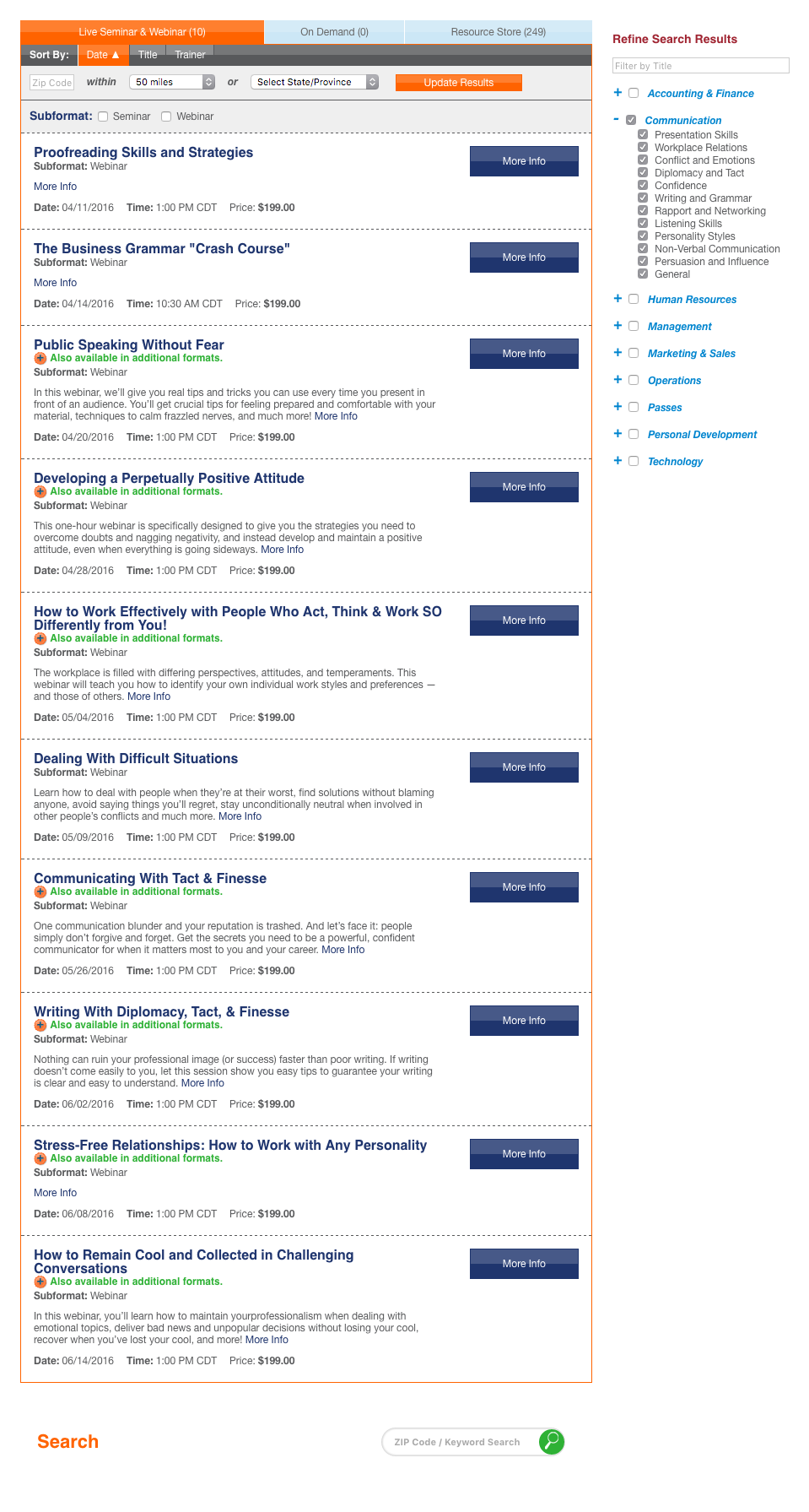
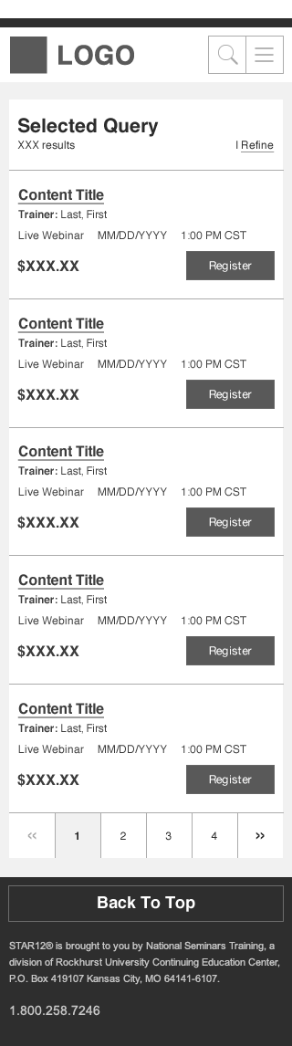
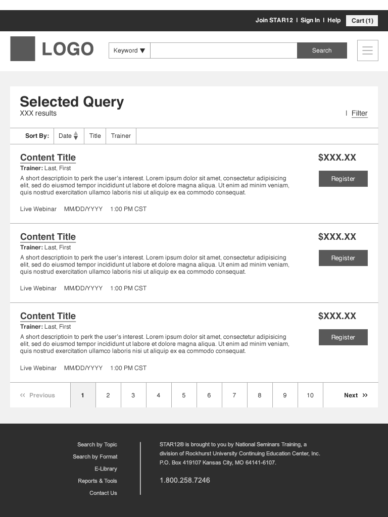
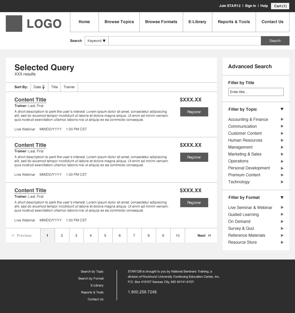
Upon entering the app, the first step for many users — whether their goal is to consume content, evaluate the product for a purchasing decision, or register training for others — is to find relevant content. The system had been previously developed with a category search system blended between training topics and their available formats. After drilling down from the main navigation, the user was taken to a results page that stacked the results by format, with search filters and refinement controls distracting from the results themselves. The experience left the user feeling overwhelmed and confused.
The solution moved the filters out of the user's scanning path and minimized the amount of real estate the refinement controls took up. The formats were organized into tabs, allowing the user to toggle between formats instead of scrolling up and down the page. Greater contrast was given between font sizes to clarify the information within the individual result items. The page load had also been slow, adding to the user's frustration, but had now been optimized with lazy loading to limit the amount of results loaded on the visible page and only loading the content within the results tabs when they were toggled to.

Learning Management System
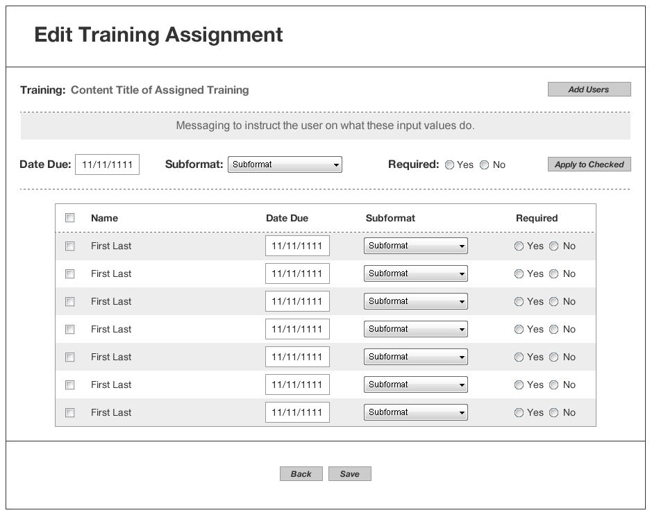
The app had two main user segments: those who consume the content and those who assign content to be consumed. The system did not previously have the functionality to assign content to other users nor did it have the ability to expose usage data to the end user, resulting in training assignments being made verbally or by email and frequent calls to the support team to run usage reports manually.
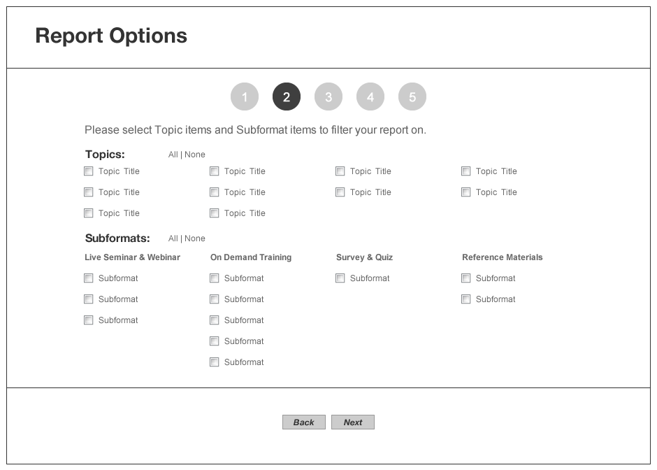
A Learning Management System (LMS) was built from the ground up to better enable the content assignment interaction and limit the requests for manual reports. The system included an additional area on the home page dashboard to house training assignments received, extended functionality of the content search to assign the training, an listing page of training currently assigned out to others, and a reporting feature that included various configurable filters and parameters.
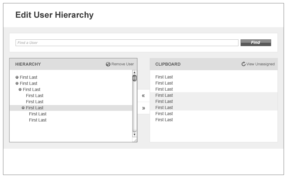
In addition to assigning and reporting, a hierarchy system also had to be created. This not only dictated who could give or receive training assignments, but also who could run usage reports on the training in order to mirror organizational reporting structures and protect the privacy of those receiving training. This was especially important since, depending on the type of training assignment, it could indicate that corrective action had been taken on an employee.
Responsive Redesign
During my tenure, the mobile revolution happened and it seemed the training industry was the last to take note. Although it was not immediately commissioned, I work alongside the development team to prepare the legacy system to be ported over to a responsive design.
In preparation, small changes like swapping out fixed units for relative units helped make the transition smoother when the project was finally commissioned. The modular framework that we designed (based on OOCSS, SMACSS, and BEM) also added to the project's success. By deferring layout decisions to grid systems and not the modules themselves, we created an environment where we only make small adjustments to UI components versus entire pages wholesale. Additionally, the modularity encouraged reuse design patterns, strengthening the consistency of the UI and the overall experience for the user.
The Process
Research
Research was primarily conducted through interviews with project sponsors, primary stakeholders, and customer-facing team members. This aided in unearthing information that was already available internally as well as get a sense of the vision for the projects and the problems we were trying to solve. Further information was provided through customer surveys and customer interviews over the telephone as well as face-to-face. As the process matured, collaborative workshops were co-facilitated with team members from other departments in order to create consensus among stakeholders as well as socialize our research findings.
Comparative analyses were ran to investigate interface and interaction heuristics in the wild, reviewing what worked and didn't work in order to incorporate the more successful instances as a starting point for new features. This technique not only expedited production time by deferring to pre-established design patterns, it also softened the onboarding experience for users by utilizing patterns they were already familiar with.
Design
Almost every design started out on paper or on a whiteboard as a conversation tool with the Product Owner, both taking turns to sketch out ideas and vet concepts. As we did so, project requirements were addressed and the PO would either take them back to the project sponsor and stakeholders for further discussion or we would move forward for reviewing technical requirements with the dev team. Eventually, the dev team was pulled into the discussion as early as possible in order to streamline the process and address any technical constraints head on.
Wireframes and prototypes were used heavily as front-end code was as much of the design process as visual comps. We eventually evolved away from high fidelity mockups, opting to get designs into code as quickly as possible. We relied on sketches on paper or whiteboards to ideate, wireframes to address layout and content structure, prototypes to address interactions and flows, and code to bring it to life. We eventually delayed new designs to just a week before development, embracing the just-in-time concept of lean manufacturing, in order to keep the systems up to date and avoid double work.
Evaluation
Although admittedly not as strong as what would have been preferred, the evaluation phase consisted of deskside testing with members of the core team, hallway testing with members outside the core team and with limited exposure to the product, usability testing with new hires, and eventually remote unmoderated testing that was recorded, reviewed, and annotated. Stakeholder reviews, like with most products, were also a big part of the evaluation process. Findings from the testing sessions were incorporated more and more as we went on in order to keep the discussions and decision-making centered on the user. Before I left, a frequent testing schedule was underway and was attracting the interest of various stakeholders.
The Outcome
By the end of my stay, subscriptions increased 460%, renewal rates increased to 90%, and revenue for the app increased to 30% of total contributions. Internal interviews also revealed that complaints on product usability decreased and overall satisfaction increased.
From a team perspective, the bonds had been mended between design and development through increased collaboration and knowledge sharing, which ultimately translated to a higher quality product. The use of a modular framework and the inclusion of front-end code in the design process sped up production times and got updates to market sooner.